Notification Content
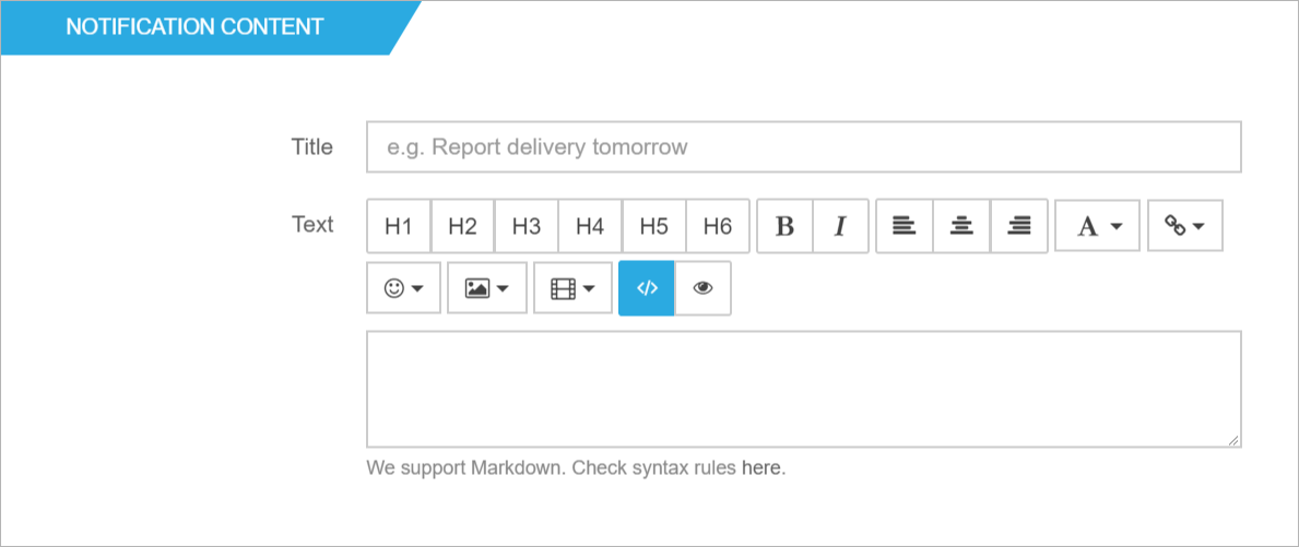
Title
A descriptive title for the notification, this will show as a small header above the alert’s text. This field is limited to 255 characters.
Text
Set the text of the alert in the text field. You can use the format buttons to define headings, alignment, weight, colors and to add icons to the text. For more information about the controls, check the next link.
Notification Styles
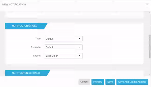
Type
Defines the style of the alert. The possible options are Success, Warning, Danger and Info. Each style has a color associated with it.
Template
There are two template options: Default and Notification.
- Default is a static alert that will be displayed on the page, inside the container of the web part.
- Notification creates sliding-in alerts that appear on a custom position on the page. You can define the position after selecting this option on Placement dropdown.
Layout
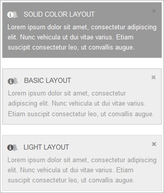
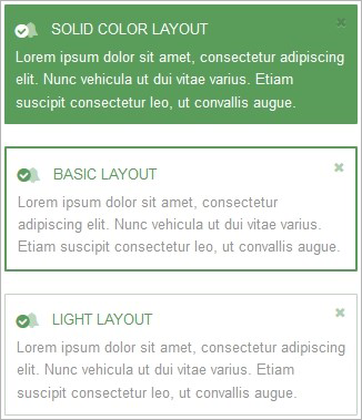
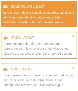
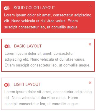
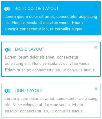
The default alert includes 3 different layouts.
- Solid Color: All the background has a color.
- Basic: Bordered alert.
- Light: Light bordered alert.
| Default Temaplate / Default | Default Temaplate / Success | Default Temaplate / Warning |
|---|---|---|
 |
 |
 |
| Default Temaplate / Danger | Default Temaplate / Info |
|---|---|
 |
 |
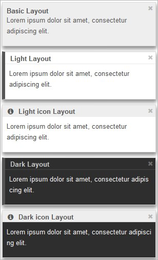
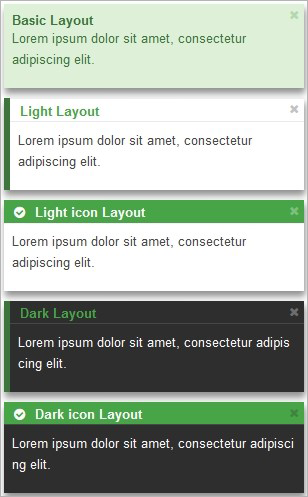
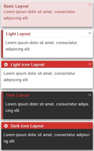
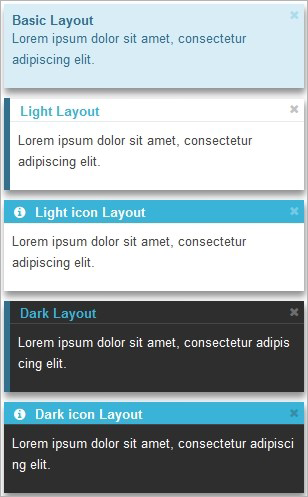
The notification alerts includes 5 different layouts.
- Basic: Default styles from Bootstrap.
- Light: Light backgrounded alert.
- Dark: Dark backgrounded alert.
- Light icon: Light backgrounded alert, with icon next to title.
- Dark icon: Dark backgrounded alert, with icon next to title.
| Notification Template / Default | Notification Template / Success | Notification Template / Warning |
|---|---|---|
 |
 |
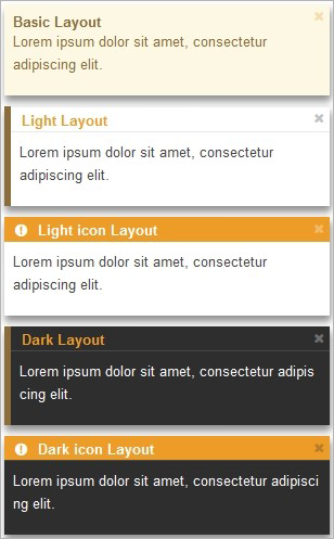 |
| Notification Template / Danger | Notification Template / Info |
|---|---|
 |
 |
Placement
Defines the horizontal or vertical positioning for the alert.
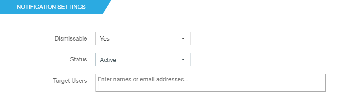
Notification Settings
Auto-hide delay
Here you can define the auto-hide interval, in seconds, for the alert. This option is only available if you have previously chosen the Notification template.
Dismissable
There are two options: Yes and No. If the alert is set to Yes, there will be an X element (on the top right side of the alert) so the user can dismiss the alert. If the user closes an alert, this means the alert will no longer be displayed to that user
Status
There are two options: Active and Inactive. Inactive alerts will not be seen by anyone.
Target Users
This option uses the people picker SharePoint controller. It allows you to limit the alert to selected user(s) or group(s). If no user or groups are set, the alert will be visible for everyone with access to the site collection where the web part is applied.
If you plan to use Active Directory groups to target your content, please check this article.
Publishing Settings
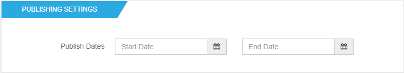
Publishing dates
Set the date range during which the alert will be live on the page by defining both the Publish Start Date and Publish End Date.
After setting everything up, click on the Preview button if you want to see how everything looks on the page, or click on Save or Save and create another.
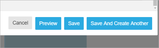
Clicking Save and create another will keep the form open, so you can add more alerts to your page without closing the form.